
Gatefold
PuraVida Post Three

There was a period from the 1960s through the next decade until about 1986 when cover art and the accompanying liner notes were at least as important as the vinyl long play record(s) inside. For us dedicated fans, album art engrossed us as we searched the images and words for added meaning to our beloved recording artists. Album cover art was a way for a musical artist to make a visual statement and an initial direct connection with fans.
Gatefold covers that opened, often housing double albums, occupied a special niche. The sprawling album art gave visual meaning to the music that, in turn, amplified the audio experience. The art was also a marker that imprinted bands like the Rolling Stones (tongue), Yes (fantasy worlds), and Little Feat (ducks with lips) on our impressionable young minds. For wannabe audiophiles like myself, knowing where and when the recording took place, the producer, the guest artists, and other random details gave added depth and meaning to the music. And what a pleasure it was to peruse the lyrics and images over and over, looking for new details, just as we listened for new textures and chords in the warmth of the spinning vinyl record.
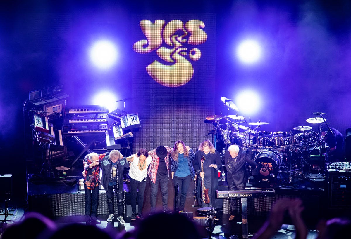
Roger Dean’s cover art for Yes’s early 1970’s albums was for many, myself included, the epitome of that visual depth and meaning, and nearly as important as the music contained within. Those albums with their elaborate packaging usually featured photos of each band member-Jon Anderson: vocals; Steve Howe: guitars; Chris Squire: bass; Bill Bruford (eventually replaced by Alan White): drums; Rick Wakeman: keys. As a young teen, seeing who the band members were was an essential part of the listening experience, but it was the artwork that captured the imaginations of millions of Yes fans.
Yes: Fragile, 1971, Artwork by Roger Dean
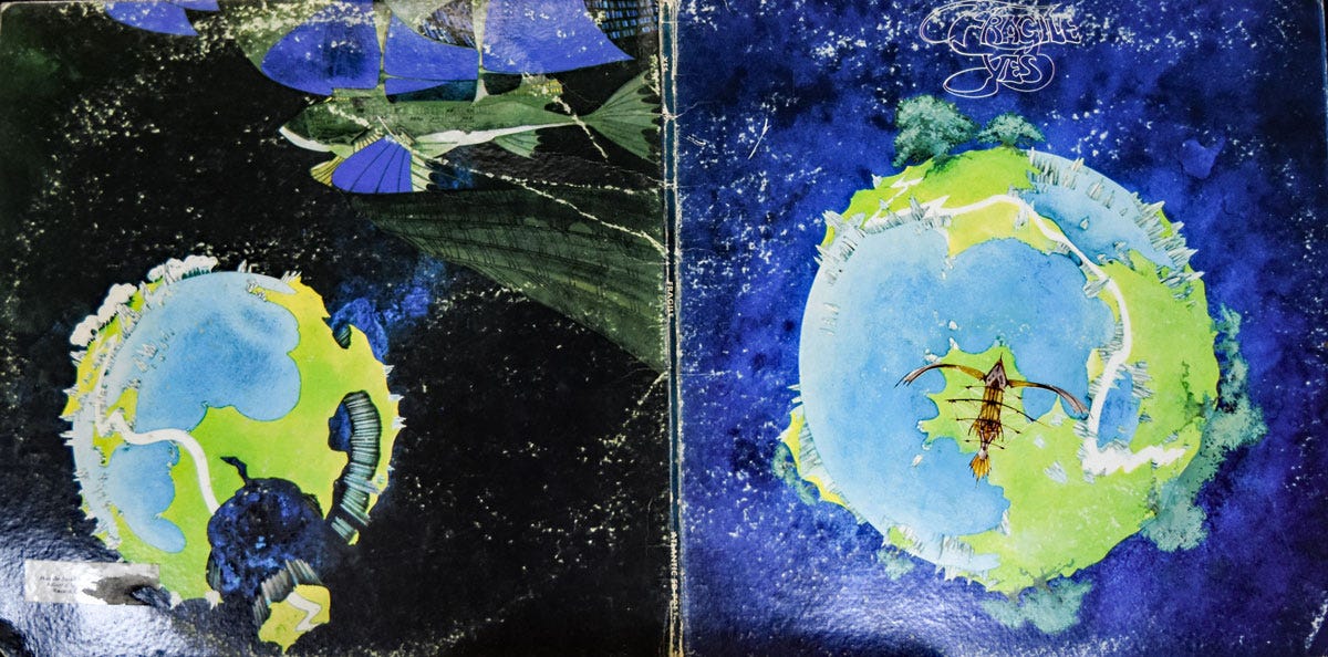
Released in November 1971, Fragile was the fourth studio and first Yes album to feature cover art by Roger Dean. Depicting a post-apocalyptic planet in the throes of disintegrating, its population escaping in a peculiar wooden “space glider,” the album’s artwork broke new artistic ground and helped to define Yes’s image, and music.
Two words describe the music on Fragile, and founding member Squire’s bass in particular: luminescent and jagged. On “Roundabout,” the album’s most well-known song, the driving melody and beat are punctuated by Squire’s bright, punchy and yes, jagged bass runs; concepts embodied in Dean’s artistic conception: on the front cover, a luminescent blue and green planet against a deep azure background evokes the “Earth Rising” image taken during the Apollo missions during that era. The jagged disintegration of the planet depicted on the back cover stands in stark contrast to the life affirming feel of the front image.
Dean has said, “Fragile was very literal, really. I think the band has named a number of their albums after their current psychological state, and 'Fragile' described the psyche of the band. And I thought about that very literally, painting a fragile world that would eventually break up.” The album’s five individual and four group tracks also underscore the notion of fragility. Is the band holding together or is it shattering into its component pieces?
Yes: Close to the Edge, 1972, Artwork by Roger Dean
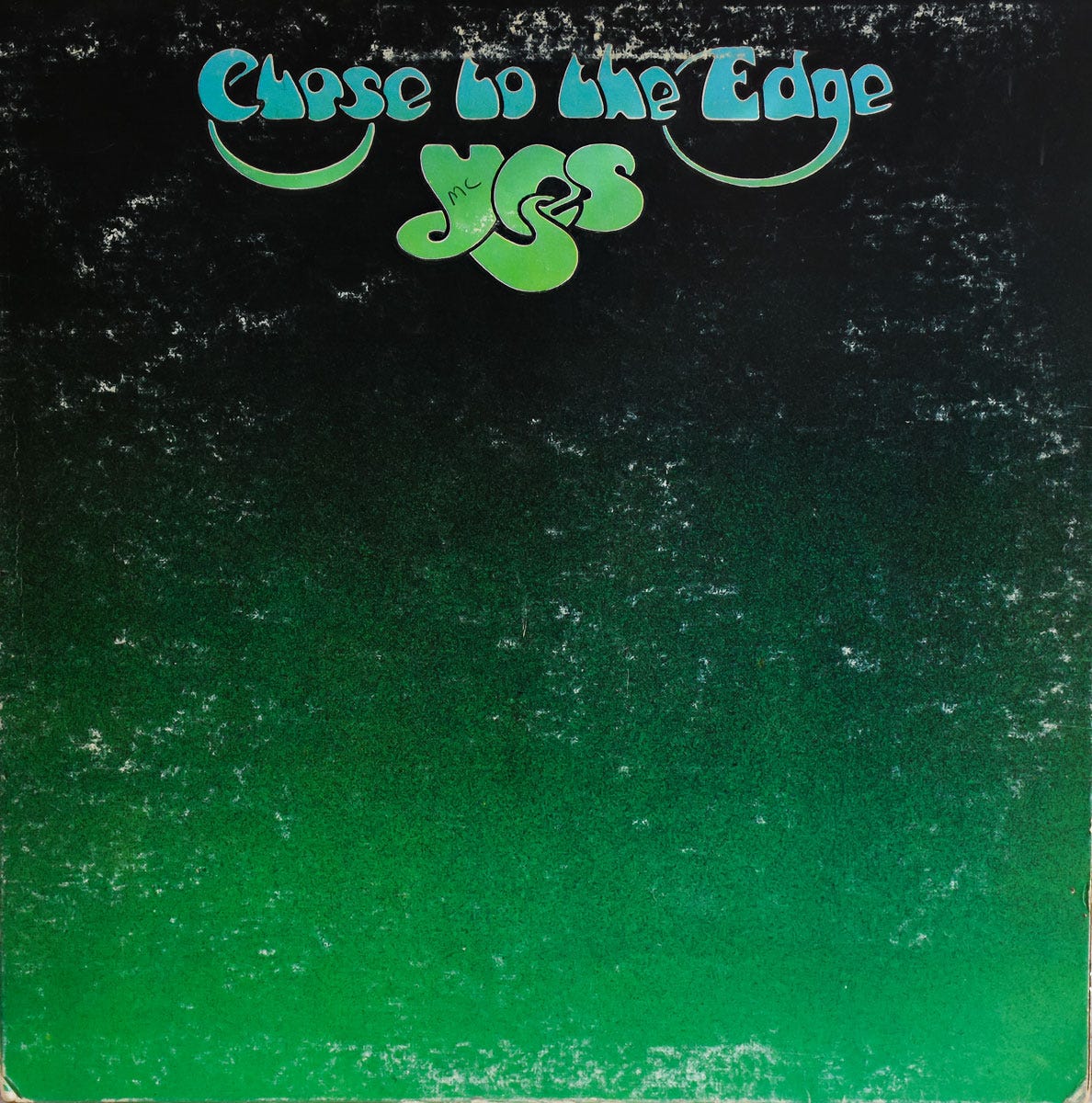
Released in September 1972, Close to the Edge (CTTE) is the album that assured Yes's place as a giant among recording artists and more significantly, as virtuoso musicians. The individual members' performances were exceeded only by the grandeur of the collective compositions that ranged from classically rendered musical themes to easily identifiable and accessible pop melodies. The album's three "songs" would also come to typify the kind of music for which Yes became known: the epic masterwork (CTTE), the uptempo rock song (Siberian Khatru), and the beautiful extended pop/love ballad (And You and I).
Close to the Edge marked the first appearance of the iconic Yes logo. In Dean’s telling, “After Fragile, I felt Yes needed a logo and designed it without talking to them. For all I knew they weren’t even going to come to me for the next album, but I still designed this logo. I did it over the course of a train journey to Brighton. I started with a notion that you can put these three letters together in an interesting way and by the time I got to Brighton, I’d pretty much done it.”
The music on CTTE is magnificent. If one regards the album as a movie score, Dean’s dramatic artwork provided the cinematic backdrop to the music: “It came with wanting to paint a world that was magical and miniature and impossible but totally credible.”
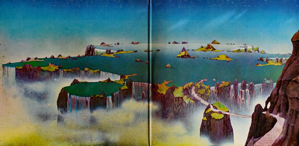
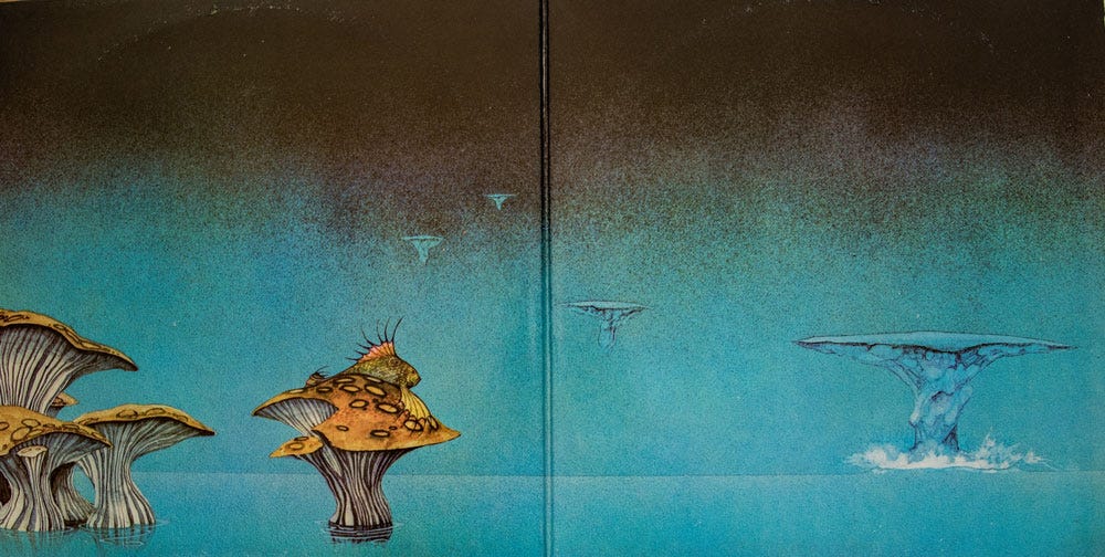
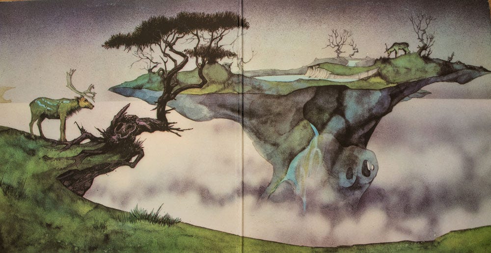
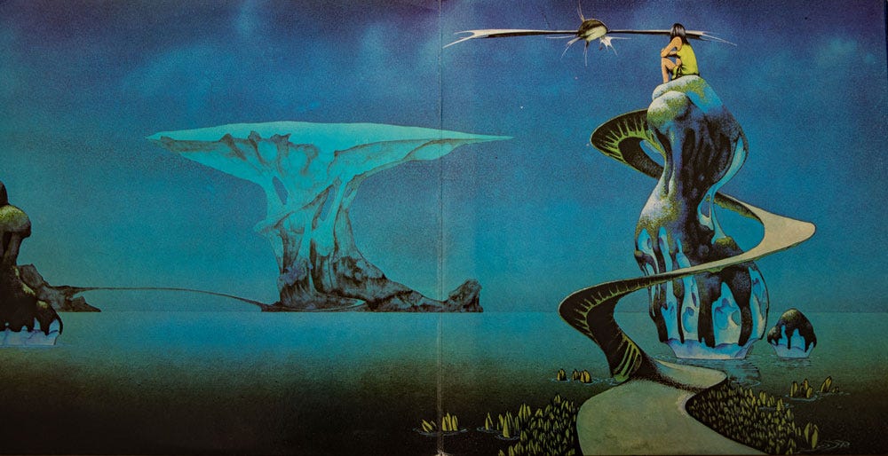
Yes: Yessongs, 1973, Artwork by Roger Dean
Yessongs, the band’s first live album, was released on May 18, 1973. The original album, three LPs contained within an elaborately designed gatefold cover, again featured Roger Dean’s gorgeous artwork. Ambitious in scope and execution, Dean’s illustrations took advantage of the gatefold cover’s large spaces to further develop the graphic concept introduced on Fragile. Highly supportive of the first illustration, "Pathways," Yes encouraged Dean to continue the visual narrative depicted on Yessongs’s four panels: “Escape,” “Arrival,” “Awakening,” and “Pathways.”
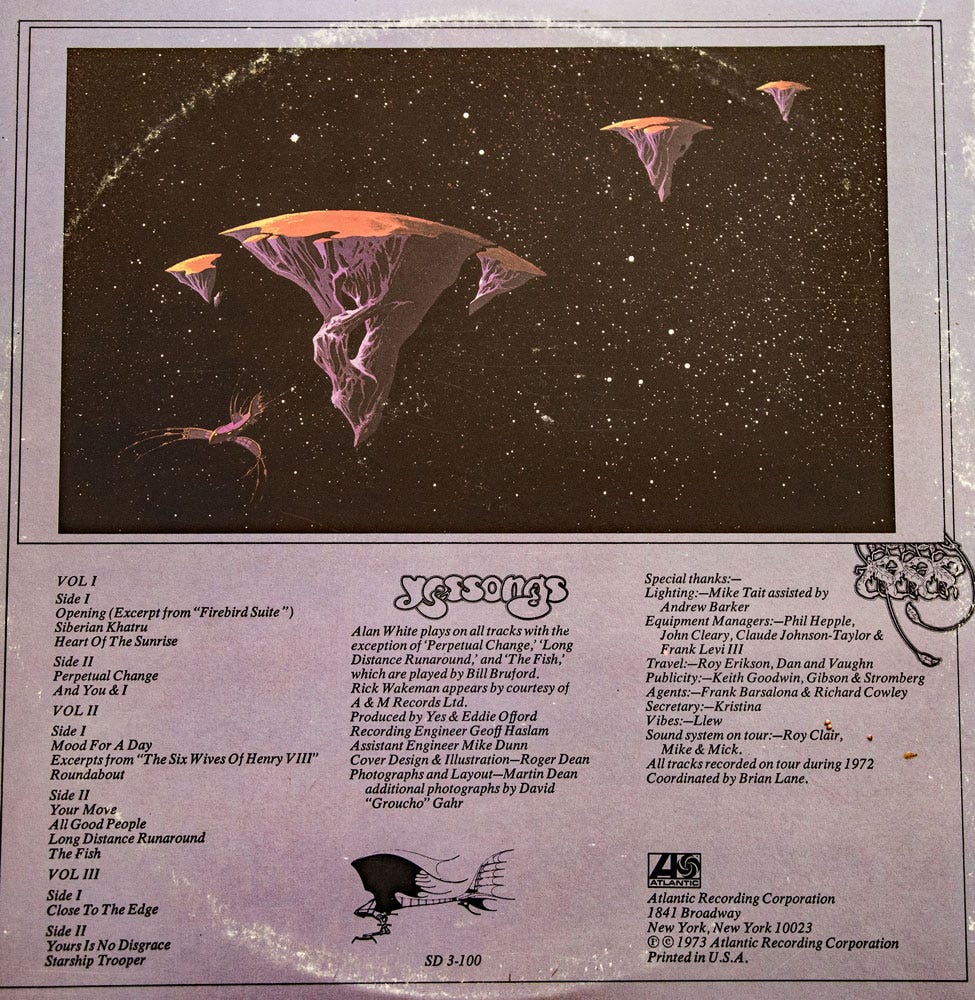
As Yes’s reputation and musical dominance-both in the studio and on the charts-became indisputable the prominence of Dean’s artwork also became essential; a perfect marriage of sight and sound.
Yes: Tales from Topographic Oceans, 1974, Artwork by Roger Dean
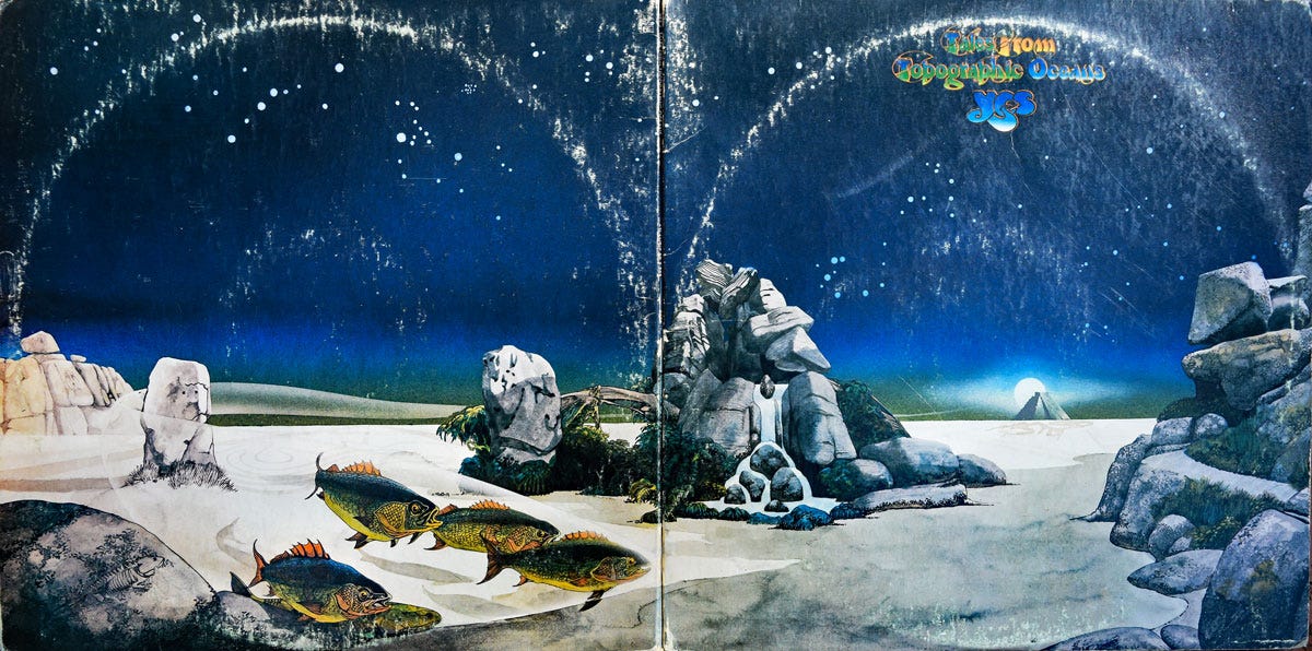
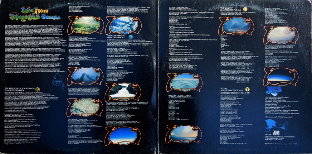
Yes’s sixth studio album, Tales from Topographic Oceans (Tales) was released in the United Kingdom on December 7, 1973, and in North America on January 9, 1974. The double album’s music, each side comprising an entire movement, is based on Jon Anderson’s reading of a footnote in “Autobiography of a Yogi” by Paramahansa Yogananda. A “concept album” through and through, Anderson collaborated primarily with Steve Howe to develop the album's themes and lyrics.
Tremendous effort went into composing the music and designing the intricate album artwork, but completing the project would come at a major cost. Wakeman left the band at the supporting tour’s conclusion and to this day, the album still divides fans and critics with some saying it’s perfect while others bemoan its inclusion of pompous filler.
Though the album may never have seen the light of day (Anderson recalled leaving the final tapes on the car roof and driving off after he and producer Eddie Offord finished the final mix), in 2023 Steve Howe remembered the Tales era as, “a time of spreading our wings, a wonderful project where we went to the ends of the Earth to do it. There was often a feeling that disaster was almost about to strike, but we got there in the end. You have to account for Tales in our history to properly talk about what Yes achieved, because it was quite exceptional. I don’t think we’d be the same group without it…Tales is totally epic, and I love it to bits.”
The artwork, while abandoning the visual narrative established with Fragile and continued through CTTE and Yessongs, nevertheless is expansive and awesome in scope. In his 1975 book, “Views,” Roger Dean wrote about Tale’s artwork: “The final collection of landmarks was more complex than ... intended because it seemed appropriate to the nature of the project that everyone who wanted to contribute should do so.... Jon Anderson wanted the Mayan temple at Chichen Itza with the sun behind it, and Alan White suggested using markings from the plains of Nazca. The result is a somewhat incongruous mixture, but effective nonetheless.”
Yes: Relayer, 1974, Artwork by Roger Dean
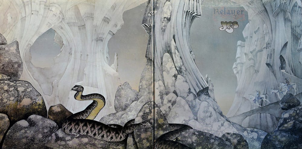
On first listen, the music on Relayer is impenetrable. New keyboardist Patrick Moraz, having replaced Rick Wakeman after his departure in May 1974, brought a jazz and improvisational sensibility to the band that was impossible to ignore and for some of us, impossibly dense. Though Relayer’s music was wildly diverse, the album followed the template established on Close to the Edge: the masterwork, the up-tempo rocker, and the soothing pop/love ballad. Upon closer inspection and repeated listenings, however, the music becomes more melodic, understandable, and ultimately accessible.
Released in November 1974, Relayer is comprised of three tracks, with "The Gates of Delirium" occupying the entirety of side one and "Sound Chaser" and "To Be Over" sharing side two. Anderson described the opening track as "a war song, a battle scene, but it's not to explain war or denounce it ... There's a prelude, a charge, a victory tune, and peace at the end, with hope for the future." Dean’s artwork once again incorporates an otherworldly tone and reflects the music contained within, the warriors on horseback echoing the musical and lyrical themes of war in “Gates…” In Views, Dean chose both Relayer’s music and artwork as his favorite for Yes.
Of course, with the advent of CDs the art became smaller and less relevant. And now, as music is increasingly downloaded and/or streamed, album art is a mere artifact of a bygone era. Today, the intertwining of Roger Dean’s spectacular artwork with Yes’s ambitious Classical Rock (as it was known in those days) would be dismissed as mere branding, I fear. But for those of us whose musical sensibilities came of age back then, the music and the images were inseparable.
The early 70s Yes albums were music from another world. In those years from 1971 to 1975, Yes was at its creative pinnacle. Despite changes in personnel, the musical ground broken on each release was unprecedented and, along with the album artwork, transported the listener on Yes’s musical journey.
The photographs in this article come from my personal album collection but all the artwork is Roger Dean’s. You can find many more examples on his website.
And you can find Yes music on your favorite streaming site or better yet, find a local record shop and peruse the stacks for the incredible artwork, for Yes or any band!
More later.
Thanks for the great article. I remember all those albums well, was a huge fan of both the music and the artwork.
Thanks for this, Mark, and for reminding everyone what a great artist Roger Dean is. His work is so imaginative and unmistakable. You can spot a Dean cover from a mile away. As a teenager, I loved lying on my bed with CTTE or TOTP blasting, completely immersed in those otherworldly landscapes.